
I had a request on the “Cypht Webmail Screen Shots” post to share some mobile/responsive views of the program. Since I always aim to please, and since the percentage of people with even a shred of interest in this project is so very very small, here it is!
Overall, my design skills fall somewhere between terrible and total shit. My design premise for the Cypht UI has been: “Don’t pretend you know what colors go well together. Don’t fool yourself into thinking you can make something slick. JUST KEEP IT SIMPLE DUMMY“.
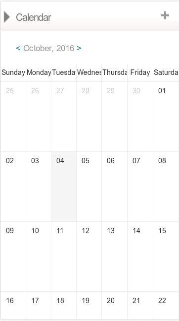
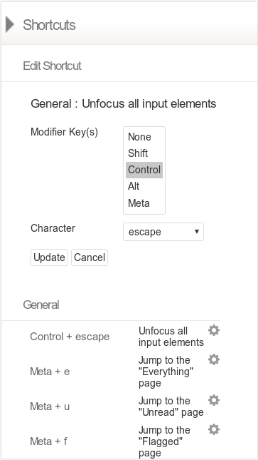
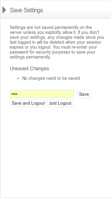
I’m pleasantly surprised with the result. It’s pretty standard webmail fare, super simple, and reasonably consistent across browsers.

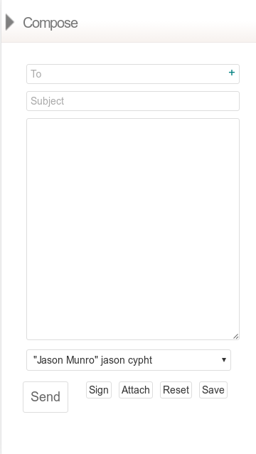

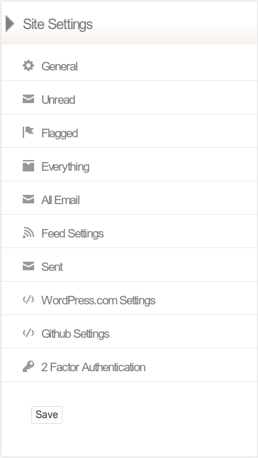
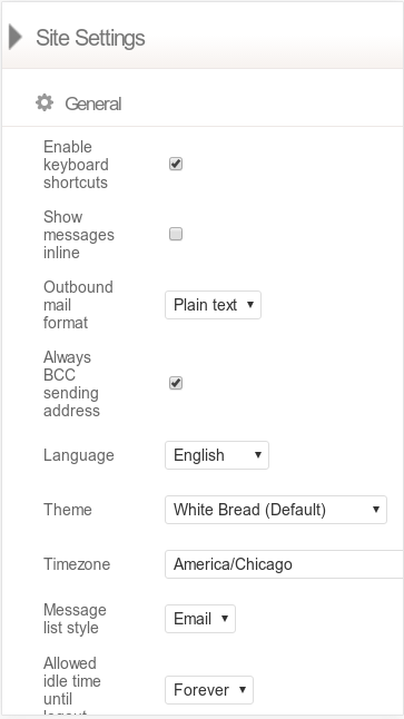
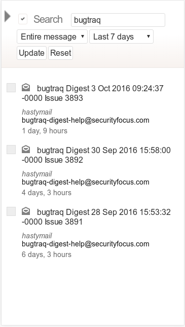


There are some noticeable omissions to this list, specifically the contacts management interface and the profiles page. I left profiles out because it looks like dog poop, and I left contacts out because I realized the screenshot was of my actual contacts and that would be dumb to post. It looked pretty good though! All in all, Cypht is pretty responsive. Writing this post helped me identify some areas we need to work on, so thanks to the person who requested it!

I like it.
I am going to install this now.
Wish me luck. Send a search party if not heard from.
Thanks
Additionally, please note that I have stayed up the whole night reading your blog.
Pingback: Even More Multiple Monitor Gaming On Linux – Unencumbered by Facts